Above Photo: Howard Lake / Flickr
The Census released its 2018 poverty report last week, which showed no change in the poverty rate from the prior year. What follows is a novel rundown of the state of poverty and welfare in the US based on my own calculations of the report’s underlying data.
The Tale of Two Measures
When you want to determine how much poverty is reduced by the nation’s welfare programs, what you normally do is determine how many people are in poverty based on the distribution of market income and then compare that number to how many people are in poverty when you include taxes and welfare benefits, i.e. the distribution of disposable income.
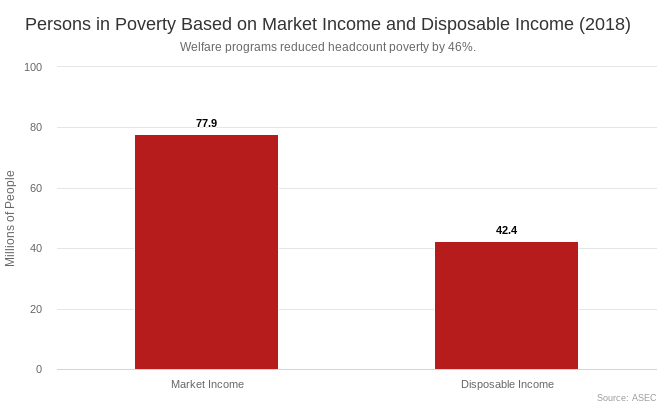
Using this approach, we see in the below graph that there are 77.9 million poor people based on market income and 42.4 million poor people based on disposable income. This is equal to a 24 percent market income poverty rate and a 13.1 percent disposable income poverty rate. According to this headcount poverty approach, the welfare state cut the amount of poverty by 46 percent.
In recent years, I have become more and more dissatisfied with this headcount poverty approach. By only counting the number of people moved over the poverty line, you miss all the good the welfare state does beneath the poverty line and you get a distorted picture of what kinds of programs are the most beneficial to those with low market incomes.
A better approach is to see how far families are below the poverty line based on market income and disposable income. The total distance poor families are from the poverty line can be expressed in dollar terms as the poverty gap.
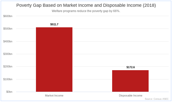
We see in the below graph that the market income poverty gap is $512 billion, which is to say that poor families are collectively $512 billion below the poverty line based on the distribution of market income. For disposable income, the poverty gap is $173 billion. This means that the welfare state cut the poverty gap by 66 percent.
Another way to illustrate the difference between headcount poverty and the poverty gap is with the next couple of graphs, which allow you to see both at the same time.
In the first graph, I have plotted market income as a percent of the poverty line for the first 25 percentiles, i.e. the bottom fourth. Incomes go up as you move from left to right and incomes get above the poverty line right at the 24th percentile, which indicates a market poverty rate of 24 percent.
To eliminate poverty, what you have to do is fill in the white area (the poverty gap) so that every percentile has an income that is at or above 100 percent of the poverty line. In the next graph, I show how much of the poverty gap is filled in by our current welfare state.
When we bring in taxes and transfers, we see that incomes get above the poverty line at the 13.1st percentile, indicating that the disposable income poverty rate is 13.1 percent. But notice how much information you miss out on by only doing a headcount measure.
The headcount measure implies that only the red wedge between the 13.1st percentile and 24th percentile matters when we are talking about poverty reduction. But clearly all of that red to the left of the 13.1st percentile also matters. Indeed, that is the majority of the poverty reduction delivered by the welfare state.
What these poverty gap figures show us is that the welfare state is perfectly capable of cutting poverty dramatically. We just need to make it bigger.
Program Effects
Using this same poverty gap approach, we can also assess how much each welfare program, acting alone, cuts the poverty gap relative to the market income poverty gap. I do this in the table below by simply adding the program in question to market income and then seeing how much lower the poverty gap is as a result.
Social Security old age benefits cut the poverty gap by 40 percent. Social Security disability benefits cut the gap by 20 percent. And so on from there. Interestingly, housing subsidies cut the poverty gap more than the Earned Income Tax Credit while Food Stamps cut the gap by the same amount as the EITC.
One caveat here is that these figures are calculated from the CPS ASEC data file. So any misreporting or underreporting contained in that file will be reflected here as well. This is true of all the poverty figures of course.
Social Security is an enormously effective way to fight poverty because it follows the one simple rule of poverty reduction: send checks to nonworking populations. In Social Security’s case, the nonworking populations are the elderly and the disabled, but as we will see in the next section, there are other similar populations still in need of the Social Security treatment.
Who Are The Poor?
Nearly all of the poor come from a fairly predictable set of nonworking groups: children, elderly, disabled, students, caregivers, and the unemployed. This is true whether you look at market income or disposable income, though the overall composition of the poor changes depending on which measure you look at.
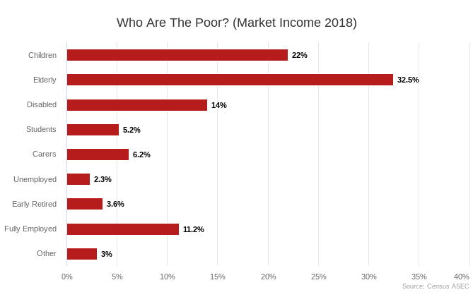
The following graph provides a breakdown of who the poor are based on the distribution of market income. As you can see, children, elderly people, disabled people, and students (the CEDS) make up 74 percent of the poor, with the fully employed (those working 50+ weeks a year) making up another 11 percent.
 The next graph is the same as the prior one except it is for disposable income rather than market income. In this graph, the CEDS make up 64 percent of the poor while the fully employed make up another 16 percent. Notably, when looking at disposable income, children are the largest group of poor people in the country.
 Given these figures, the most obvious path forward is a universal cash benefit for children, which would cut poverty for both children and the many poor adults that are living with them. The Child Tax Credit and Earned Income Tax Credit are the primary child welfare programs in our current system but they both intentionally exclude children in low-earning families and, as we see in the chart above, do relatively little to reduce poverty.
Instead of these weak tax credits, we should follow the Social Security model. Just as Social Security already provides monthly checks to elderly people and disabled people, it should also provide checks to (the parents of) children. Social Security for kids would dramatically cut poverty and is the best path forward for welfare state expansion given our current welfare situation.


